Client
Mona | Co-founder at Pink Lime
Services
Branding
Year
2025
Credits
Yousaf S (Designer)
Infos
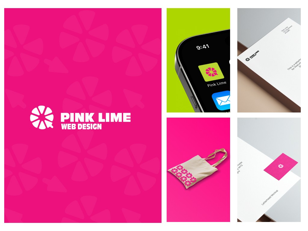
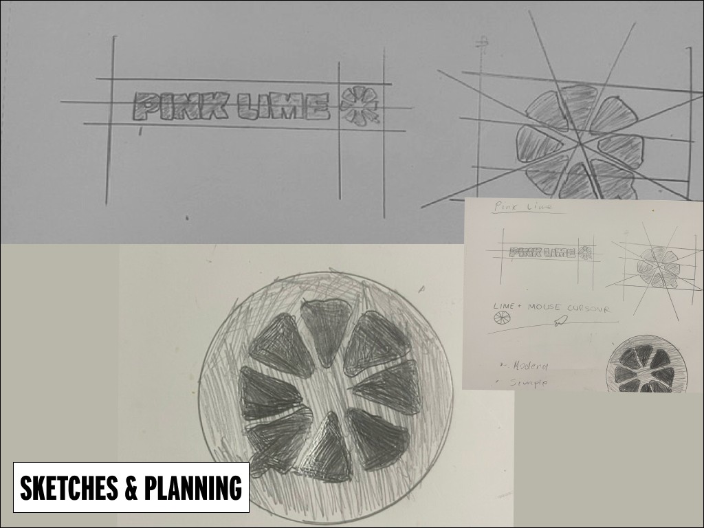
Pink Lime is a web design agency based in Manchester. After trying out a bunch of design agencies for their new branding, they decided to work with me to help bring their vision to life. Their old logo was pretty busy and didn’t really work well on their website, so they wanted something simpler, cleaner, and more modern — but still bold and unapologetic. We kept their signature bright colors — that vibrant pink (#ED117D) and lime green (#B9D531) — because those colors really capture the energy and personality they wanted. Their brand is all about being unapologetically confident, professional, and a bit playful too. One of the most important things to them is human connection. They want to make sure every client feels that human-to-human interaction — no robots, no AI. To reflect that, I kept the logo concept simple, just like how they approach genuine connections. They gave me full creative freedom, so I suggested a fresh idea: the inside of a lime with one slice replaced by a laptop cursor. It’s a subtle but clever way to show what they do without making the logo too literal or complicated. The result is clean, modern, and works well across their website, socials, and business cards. They’d been using different fonts on every page of their site, so I picked one clean, rounded font to bring everything together. It feels friendly but still polished — just like their brand. They haven’t seen the final design yet, but I’ll be showing them some mockups soon so they can really see how it all comes together.