Client Name
Saria Edwards (Owner)
Service Offered
Brand Identity
Project Kickoff
Timeline
05 Weeks
Intro / Who They Are
Coffee By The Corner is a small independent coffee shop serving coffee, breakfast, lunch, and snacks and occasionally hosting local events to bring the community together. Warm, cosy, and full of character, it's the kind of place that feels like a home away from home.
Challenge / Problem
The existing branding told a completely different story. A plain font on a white background stark, cold, and clinical. It was the opposite of what the shop actually felt like inside. Walking through the door, you felt the warmth immediately. The brand should have done that before you even arrived.
Strategy / Approach
The interior became the brief. Cosy corners, considered spaces, a sense of belonging these weren't just aesthetic details, they were strategic ones. The direction was clear: build a brand identity that earns the warmth the shop already delivers.
Solution / Design
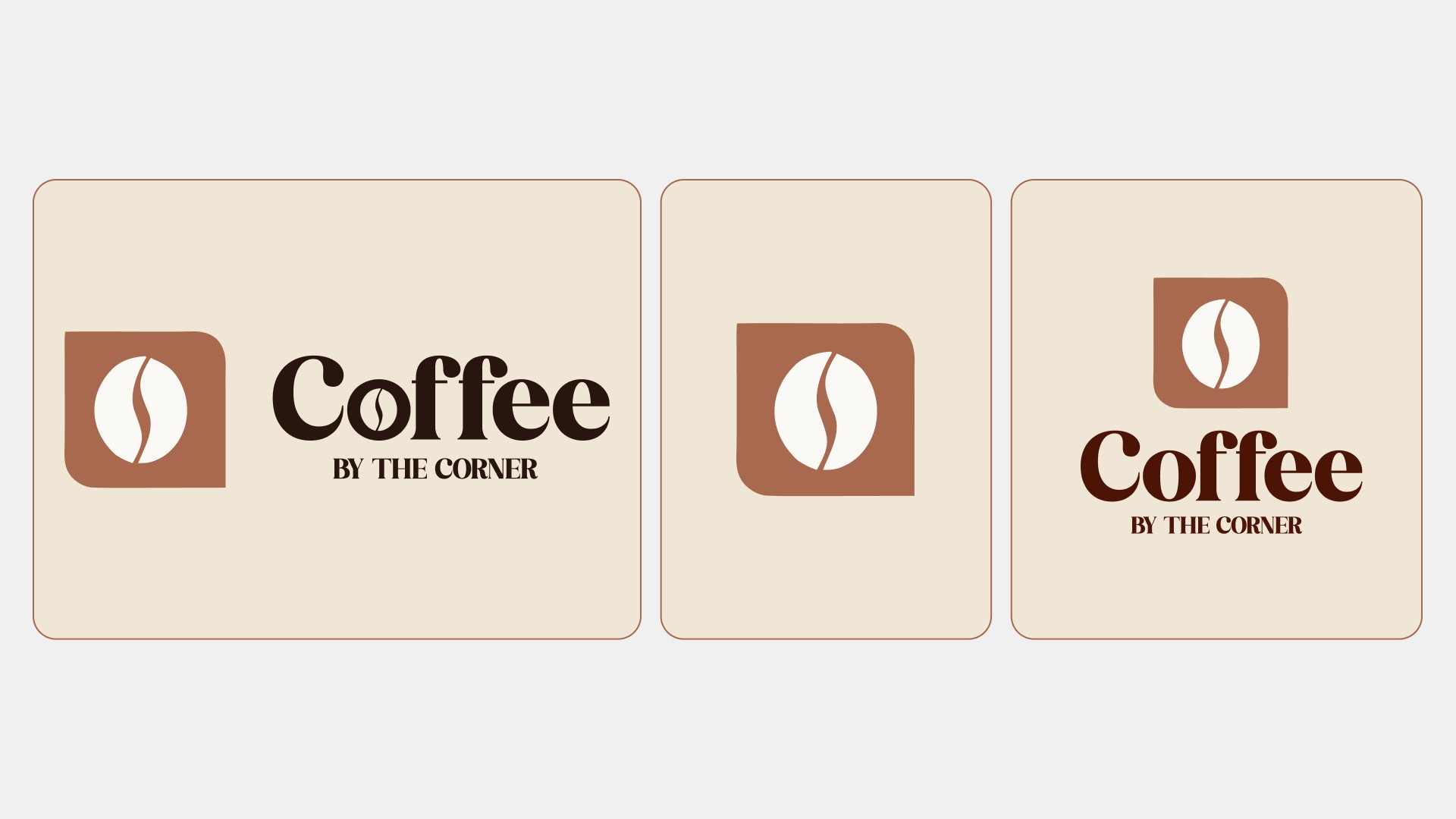
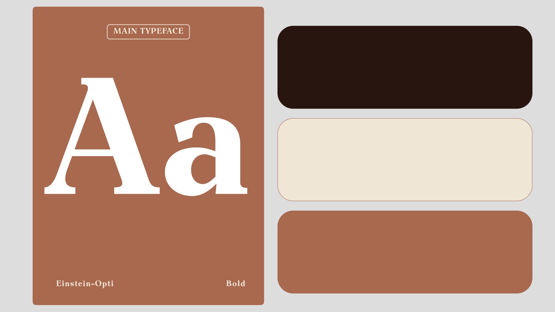
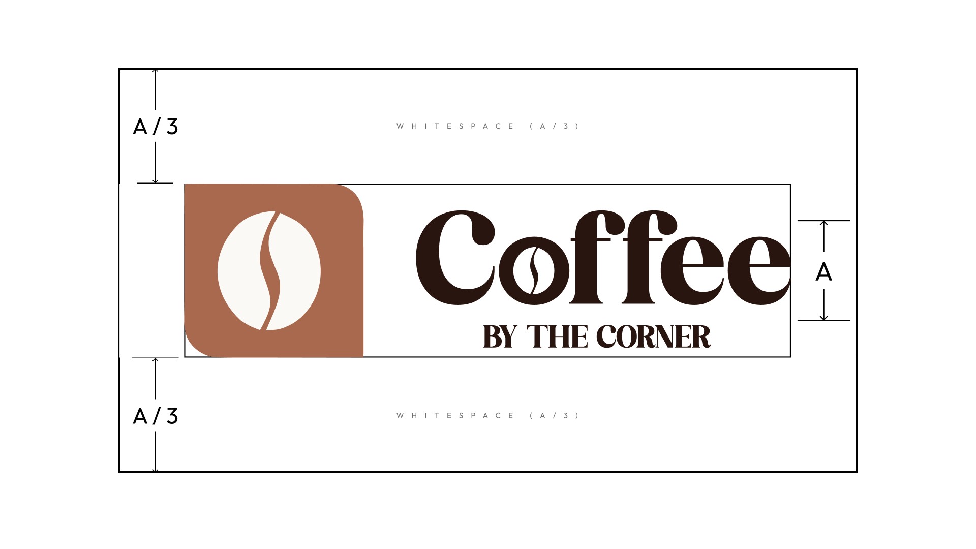
A simple identity with a deeply intentional concept. The logo mark uses a rectangle where two corners are rounded and two are sharp the sharp corners a direct, deliberate nod to the name: Coffee By The Corner. A warm palette of deep browns, terracotta, and cream replaced the cold white entirely. The result is calm, grounded, and inviting communicating a friendly, community-first approach before a word is read.
Results / Impact
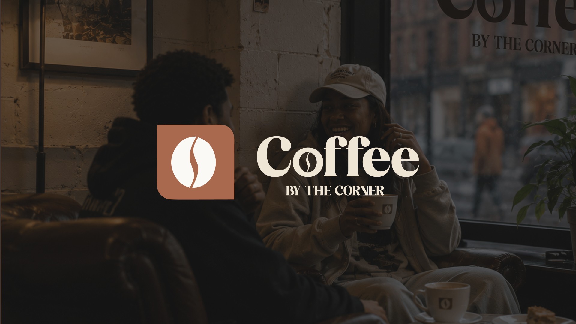
The new brand finally matches the shop it represents. It communicates warmth, friendliness, and community reflecting exactly what Coffee By The Corner is about the moment someone encounters it.
Takeaways / Learnings
A logo can look simple but carry a much deeper meaning.
The best briefs are sometimes found inside the space itself not in a document.
Brand and environment should tell the same story.