Intro
Mevo came to us feeling disconnected from their audience. Their fintech product was forward-thinking, fast, and reliable but their branding didn’t communicate that. They wanted a brand that reflected speed, clarity, trust, and simplicity.
The Challenge
At first, the brief felt tricky. We tried logos, ideas, anything but everything blended into their competition: Monzo, Revolut, Starling. Nothing felt original. Mevo needed more than a visual refresh; they needed a brand that carried meaning and connected with the people who use it: risk-takers, small business owners, and anyone who values simple, reliable, fast banking.
Strategy & Approach
We started with a strategy session to uncover Mevo’s core values:
Simplicity – everything should be intuitive
Reliability – trustworthy and stable
Progress – movement forward
Connection – human, approachable
These principles guided every design decision from here on.
The Solution
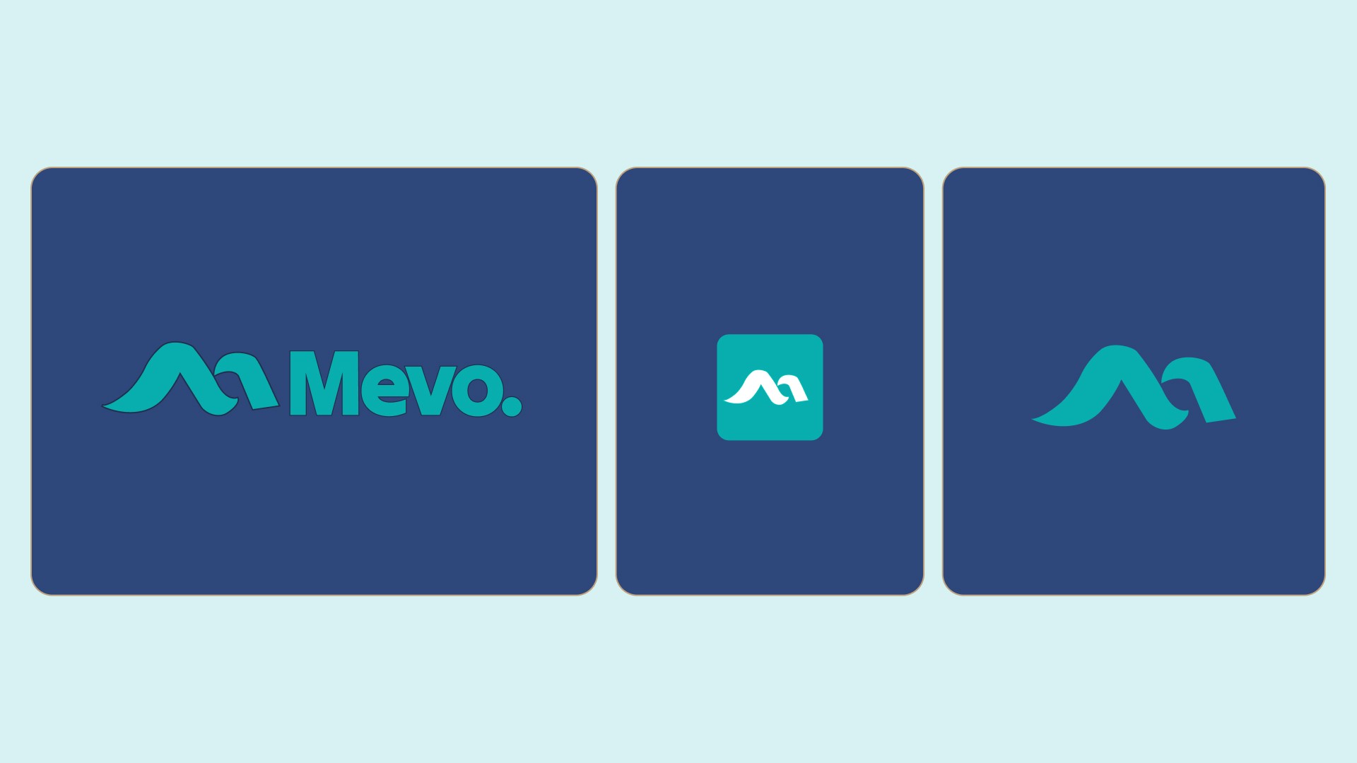
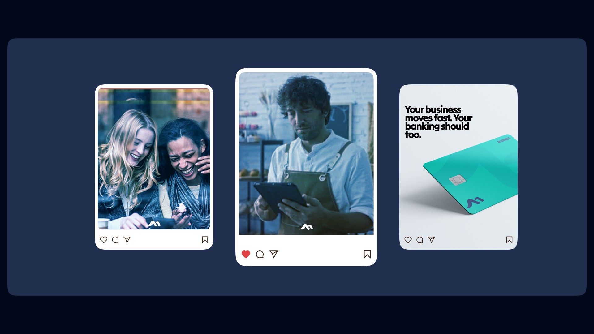
Once the strategy was clear, the design came naturally. Inspiration struck when we thought about movement: money moves, people move, businesses move. Waves move. And then it clicked: two waves forming an “M”.
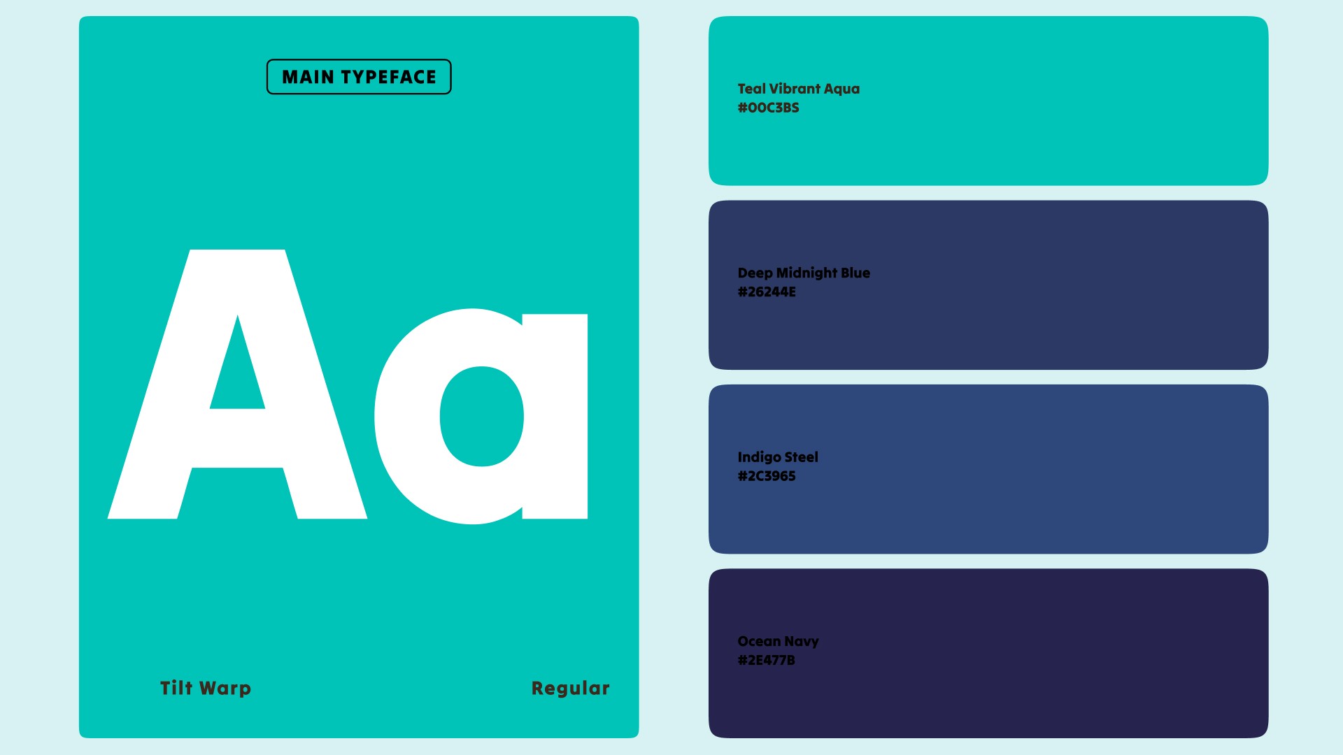
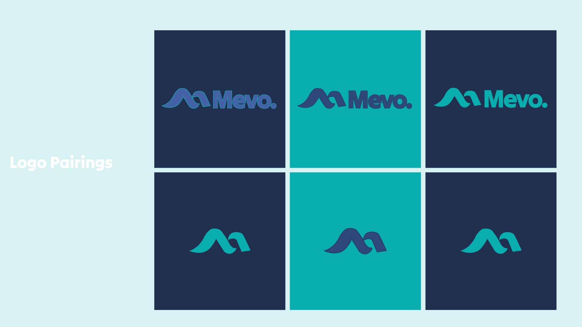
Logo: Two flowing waves forming an “M” simple, adaptable, and meaningful.
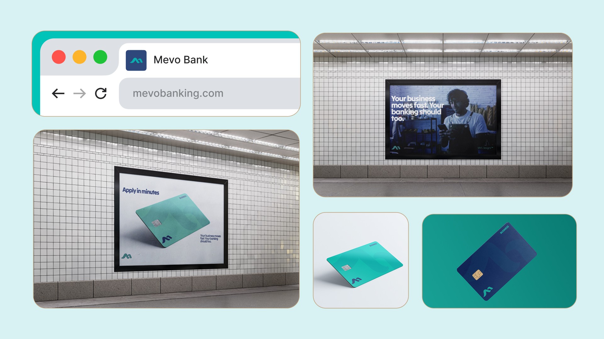
Visual Identity: Fluid forms for movement and progress, paired with structured layouts and deep blues for stability and trust.
Tone: Calm yet confident, fast yet dependable, signaling clearly that banking moves forward with Mevo.
Everything aligned the brief, the market, the meaning of the name and a clear direction emerged.
Results
Mevo’s new brand finally reflects who they really are. It communicates: simplicity, reliability, progress, and connection. Users immediately see a fintech that moves with them fast, trustworthy, and human.
The qualitative impact is clear: the brand now resonates with risk-takers, doers, and small business owners, building trust and engagement while setting Mevo apart in a crowded fintech landscape.
Takeaways
Inspiration often comes from stepping back and connecting the dots only you can see.
Build for the people who actually need it risk-takers, doers, small business owners.
Simplicity is powerful. Complexity might impress no one but yourself.
Mevo isn’t just a logo or a name. It’s movement, it’s flow, it’s something that carries people forward. When your brand reflects who you actually are, everything starts to align.


Back to all work