Intro
Pink Lime is a Manchester-based, women-led web design agency. They help small businesses and startups build high-quality websites that feel credible, modern, and human.
Even the best designers can fall into "The professional who can’t fix their own work” trap Pink Lime’s branding and website weren’t reflecting the quality of work they deliver. Their playful, human approach wasn’t visible, and potential clients weren’t seeing the full picture of who they are.
The Challenge
Despite strong client work, Pink Lime’s logo and branding had become outdated. Small, incremental tweaks over time unintentionally reduced the logo’s quality. Their website and visuals didn’t communicate their professionalism, creativity, or personality.
The problem wasn’t capability it was perception. Potential clients saw a brand that looked behind the times, making it harder to build trust and authority.
Strategy & Approach
Our goal was clear: create a brand identity that communicates credibility, modernity, and personality, while keeping Pink Lime’s legacy intact.
Key considerations:
Preserve legacy: Keep the signature pink to maintain brand recognition.
Show personality: A playful but professional logo that communicates human connection.
Signal credibility: Design elements that show they can deliver premium web design services.
Highlight USP: Serious but not corporate, human but not soft, professional but approachable.
The Solution
We delivered a complete brand redesign:
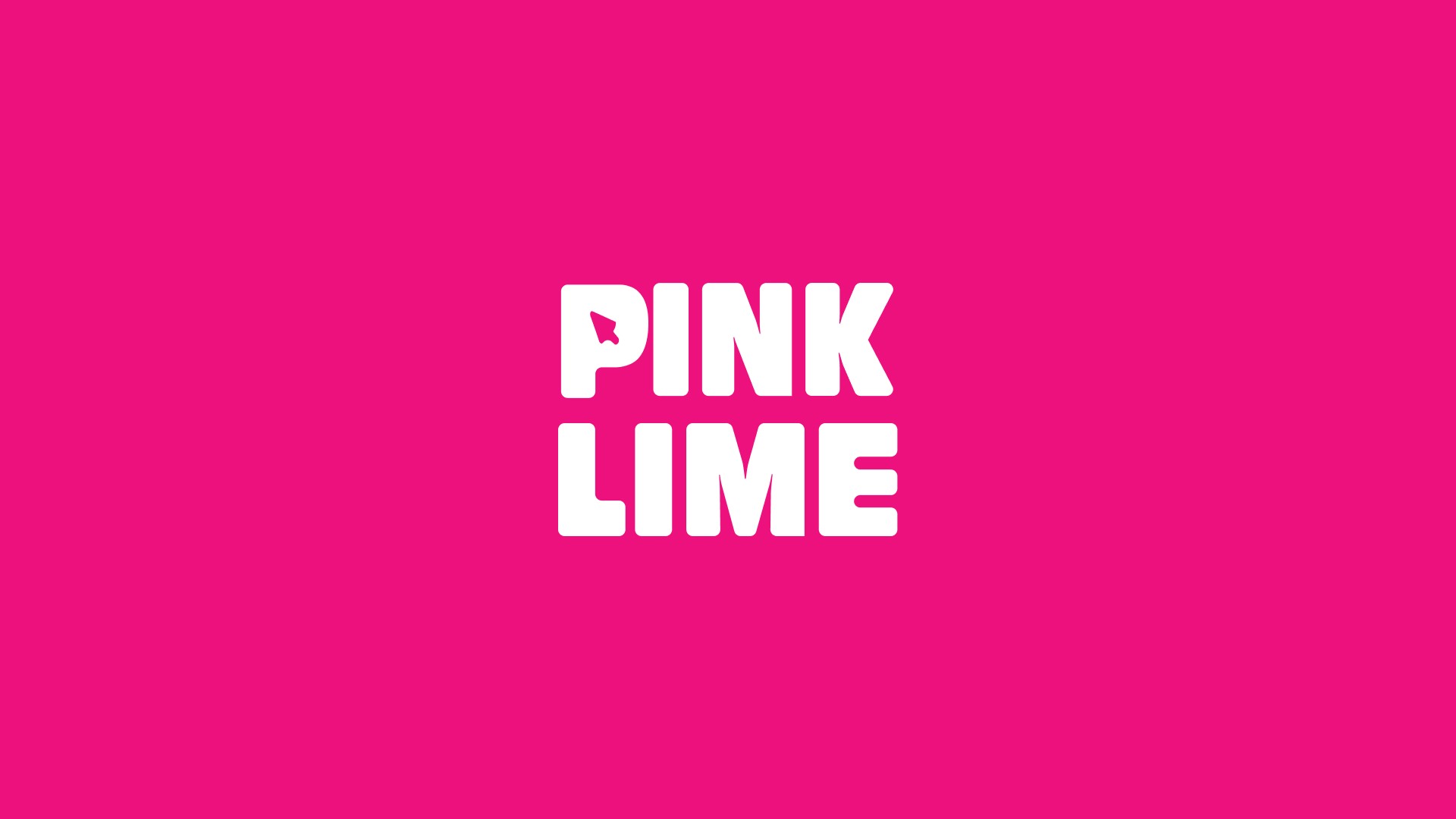
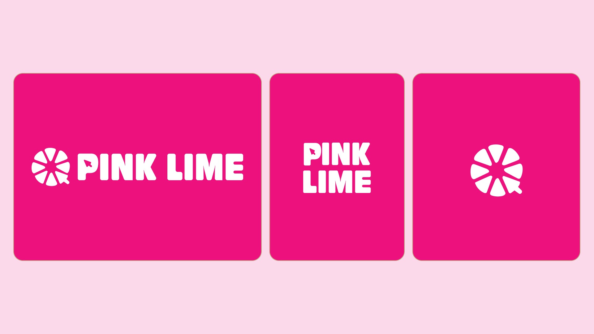
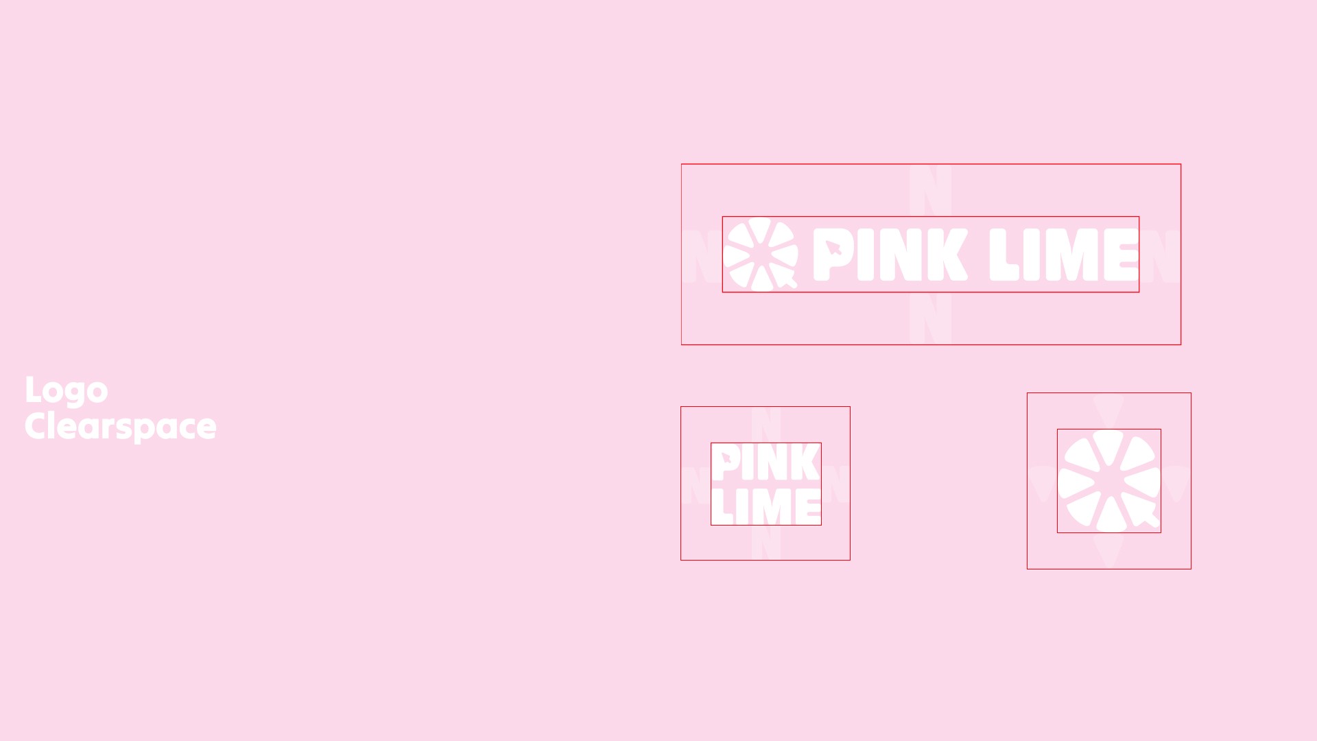
Logo: A lime with a slice replaced by a cursor rounded, calm, modern, and playful.
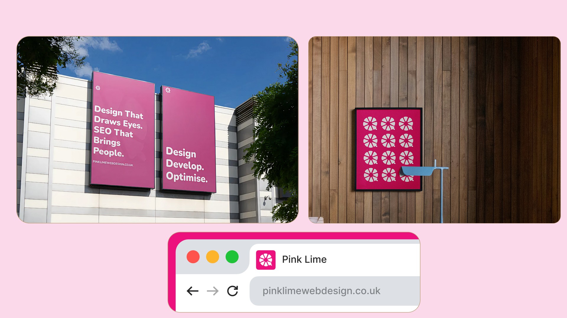
Visual identity: Updated colors, typography, and graphics aligned with the brand’s personality.
Tone: Communicates approachability, professionalism, and credibility simultaneously.
Every element reinforces Pink Lime’s USP a women-led agency that prioritizes real human connection in web design. Their new identity clearly shows: they are friendly, professional, modern, and capable of delivering high-quality work.
Results
The redesign immediately elevated Pink Lime’s credibility. Now, their branding matches their work: clients see a professional, playful, and human agency. The perception shift alone makes them more trustworthy, approachable, and premium in the eyes of potential clients.
Even without quantitative metrics, the qualitative impact is clear: their brand now speaks their value before a single conversation.
Takeaway
A brand isn’t just a logo or a website it’s how people perceive your capability and personality. For Pink Lime, modernizing the visual identity while keeping playful human touches created a brand that finally reflects who they really are: professional, approachable, and credible.


Back to all work