Intro / Who they are
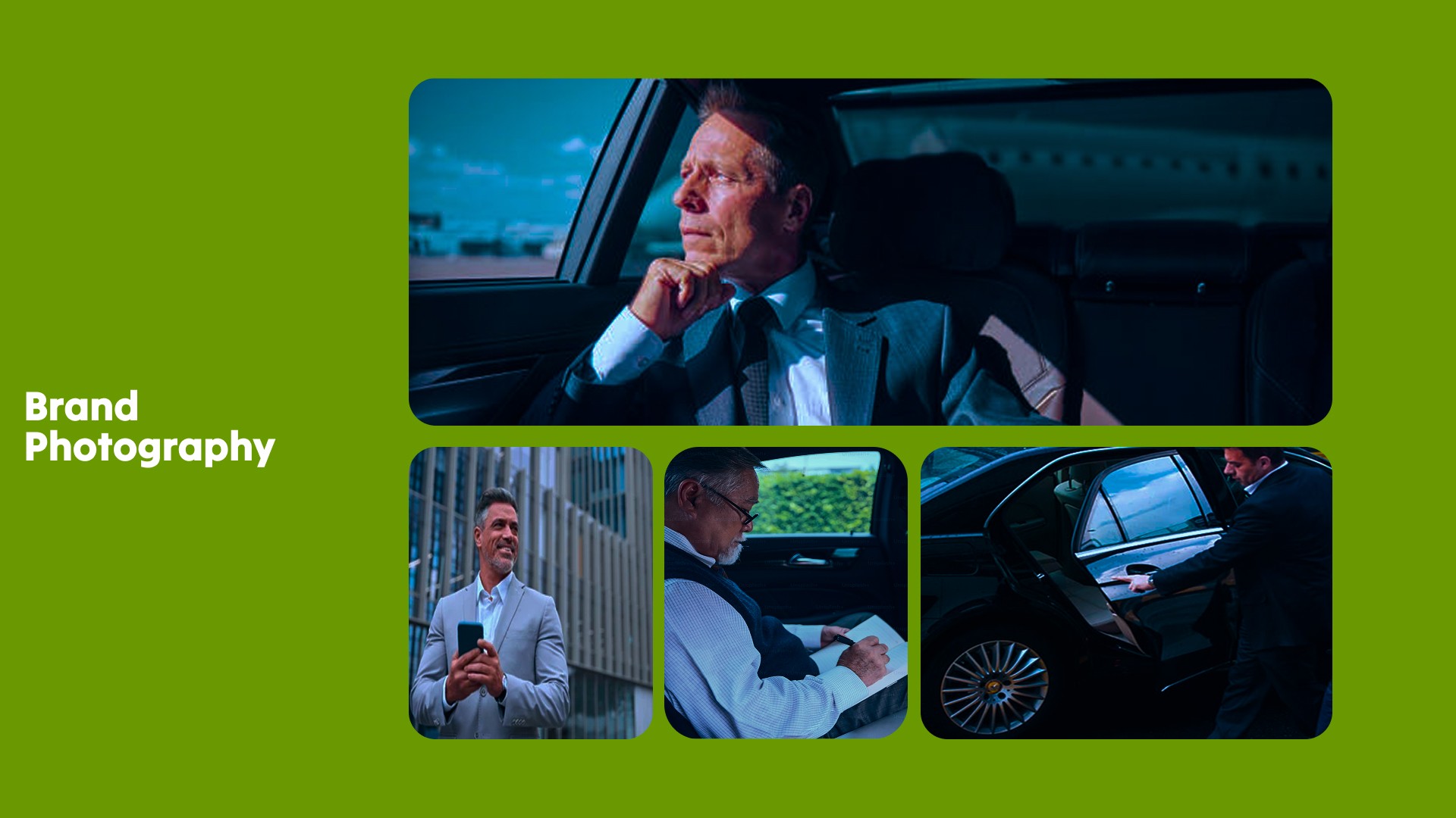
Rapid Transit is a premium ride-hailing service designed for business professionals. Built for those who value time, efficiency, and experience, it sits between traditional taxis and executive chauffeur services offering speed without sacrificing comfort.
Challenge / Problem
The challenge was creating a brand that didn’t feel like just another Uber-style service. Most competitors lean either cheap and fast, or premium and slow.
Rapid Transit needed to sit in a different lane:
Fast. Precise. High-end.
A service that feels like it respects your time while still delivering a business-class experience.
Strategy / Approach
We built the brand around three core principles:
Speed — immediate, responsive, always moving
Efficiency — no friction, no wasted time
Luxury — elevated, exclusive, premium feel
Everything had to communicate movement and control — not chaos.
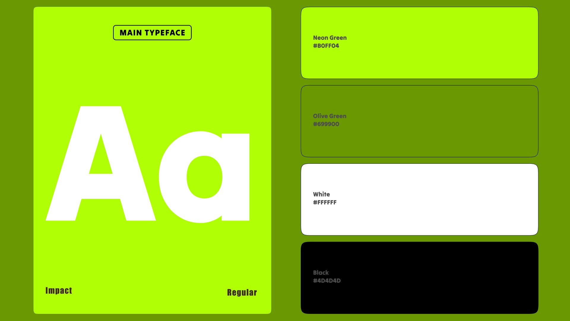
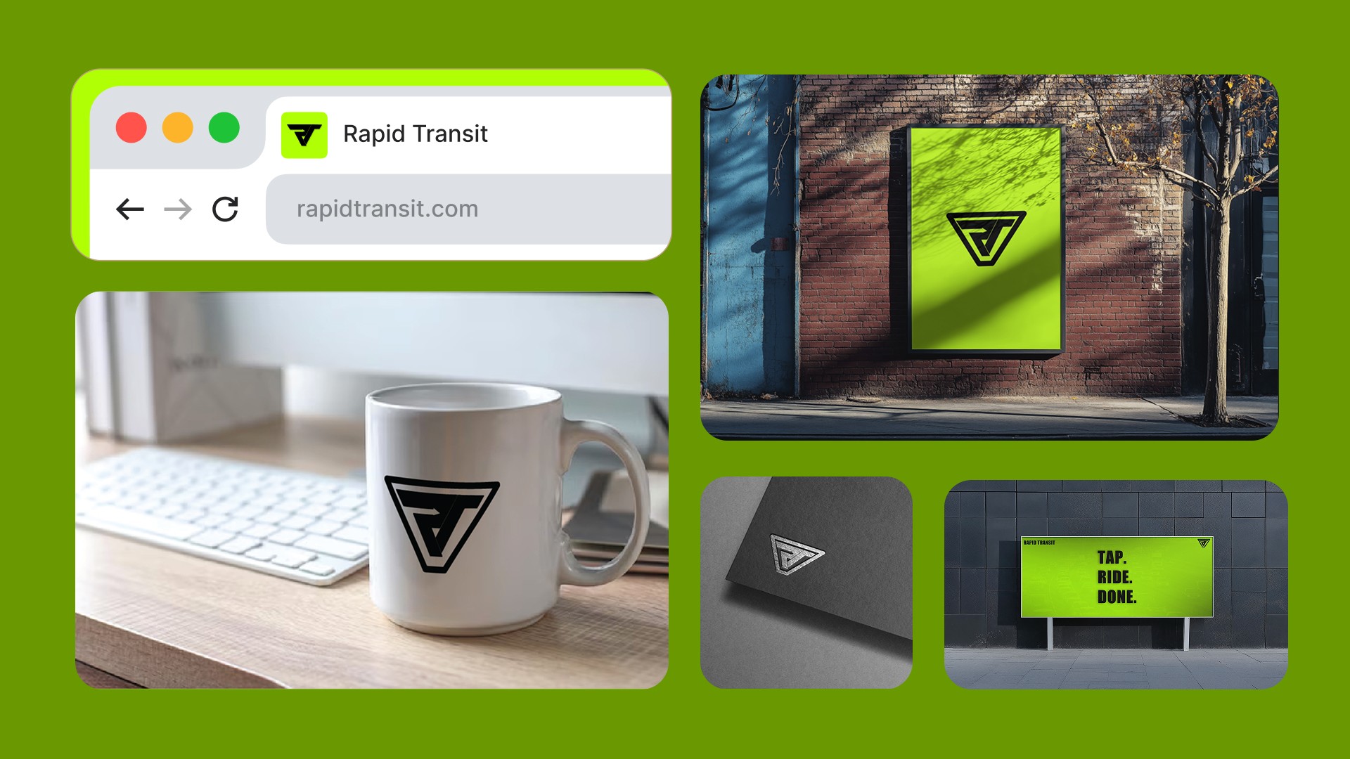
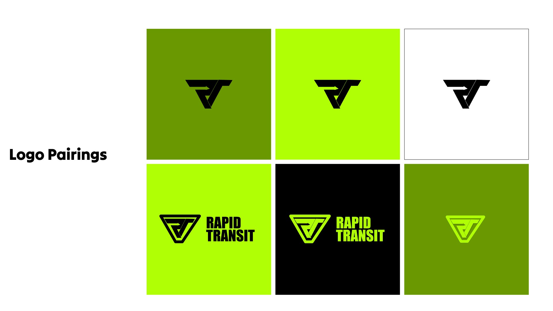
Solution / Design
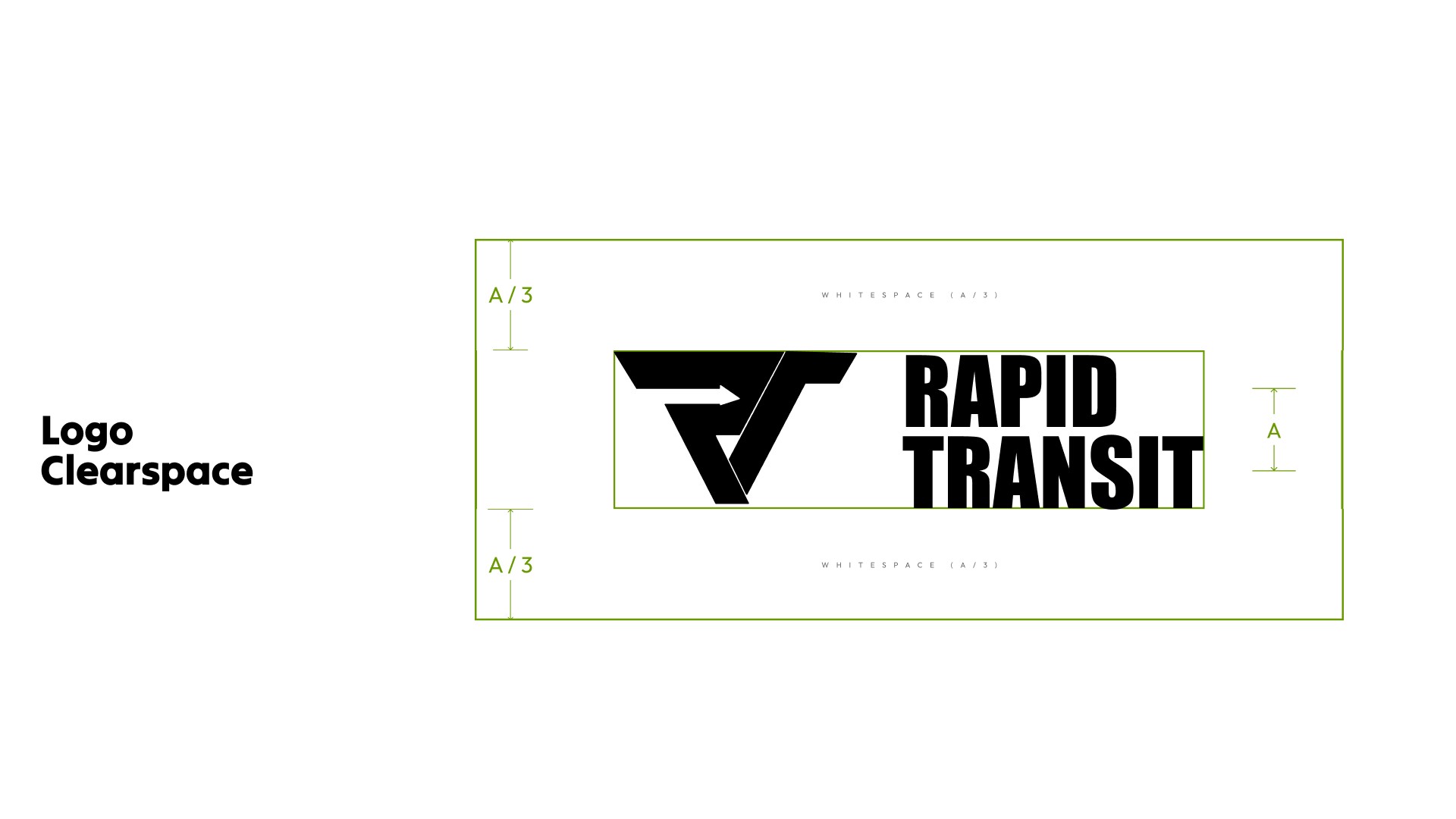
The logo merges an R and T, forming a clean, structured mark.
At the centre of the “R”, we introduced an arrow, representing forward motion, precision, and direction a subtle but powerful signal of speed.
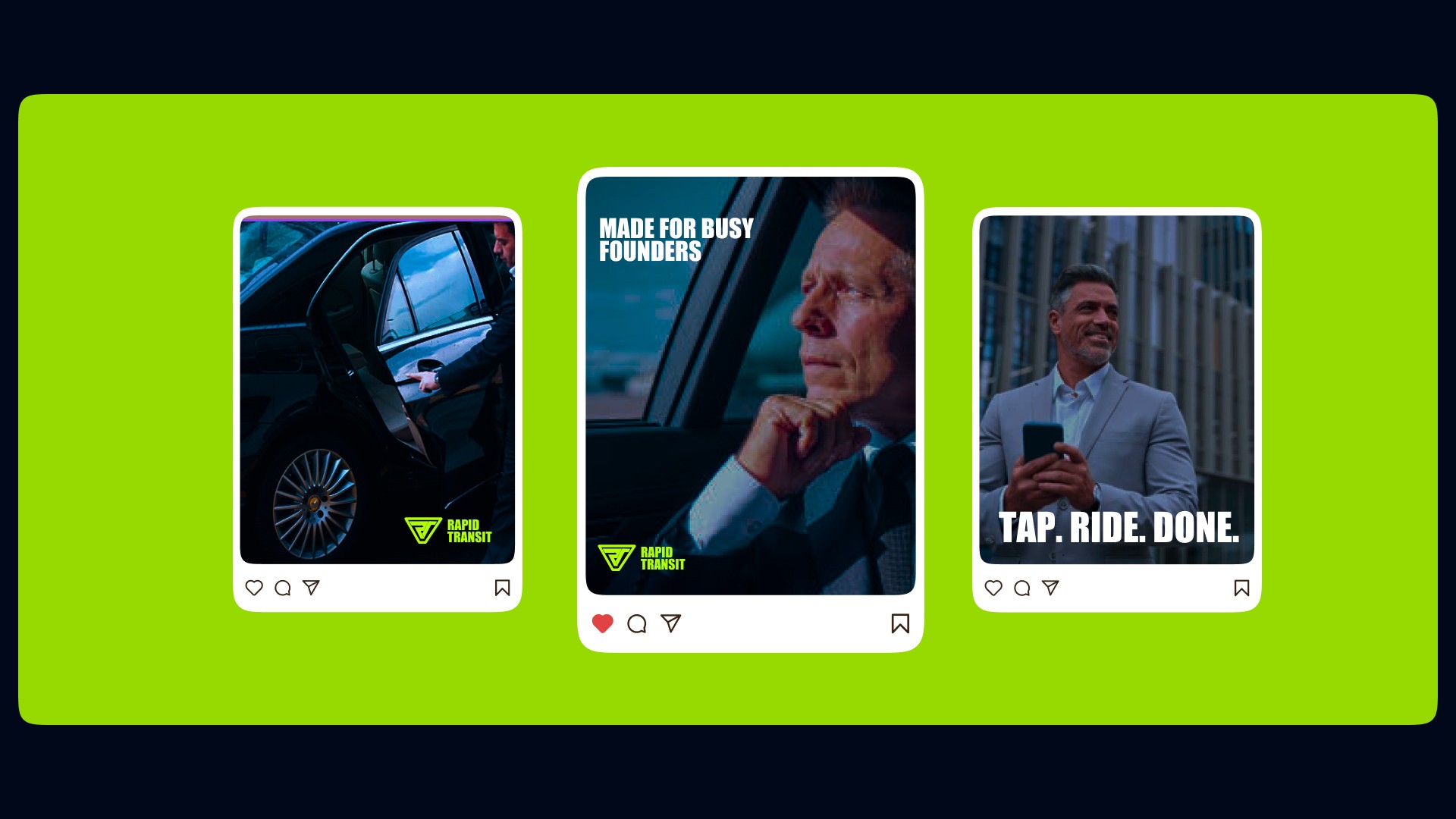
The neon green colour choice reinforces this inspired by energy, motion, and high pace cutting through the typical muted tones in the space.
Paired with darker, refined tones, the result balances:
Fast energy + controlled luxury.
it feels quick, but never rushed. Premium, but not slow.
Results / Impact
Rapid Transit now stands apart as a service built for people who move differently.
The brand communicates exactly what the experience delivers:
Fast, efficient travel with a level of quality that feels considered and high-end.


Back to all work