Intro / Who They Are
Veloria Home offers stylish, practical homeware designed to make every space feel calm, cosy, and welcoming. From bedding and pillows to towels and accessories, they help customers bring comfort and elegance into everyday living. Before working with us, their branding didn’t reflect this it felt generic, lifeless, and disconnected from the warmth their products deliver.
Challenge / Problem
The existing identity was basic a plain black-and-white logo on a shopping bag. It lacked personality, vibrancy, and any connection to the home or products. Veloria Home needed a brand that immediately communicated comfort, quality, and approachability while standing out in the competitive home retail space.
Strategy / Approach
We centred our work on the customer experience and how Veloria Home wanted people to feel. Four core values guided every decision:
Warmth & Comfort – calm, cosy, and welcoming.
Modern Elegance – clean, stylish designs that elevate spaces without overpowering.
Thoughtful Quality – carefully crafted items that feel solid and reliable.
Elevated Simplicity – intuitive, natural designs that fit seamlessly into any home.
These principles shaped every visual, typographic, and tonal decision, ensuring the brand felt coherent, inviting, and practical.
Solution / Design
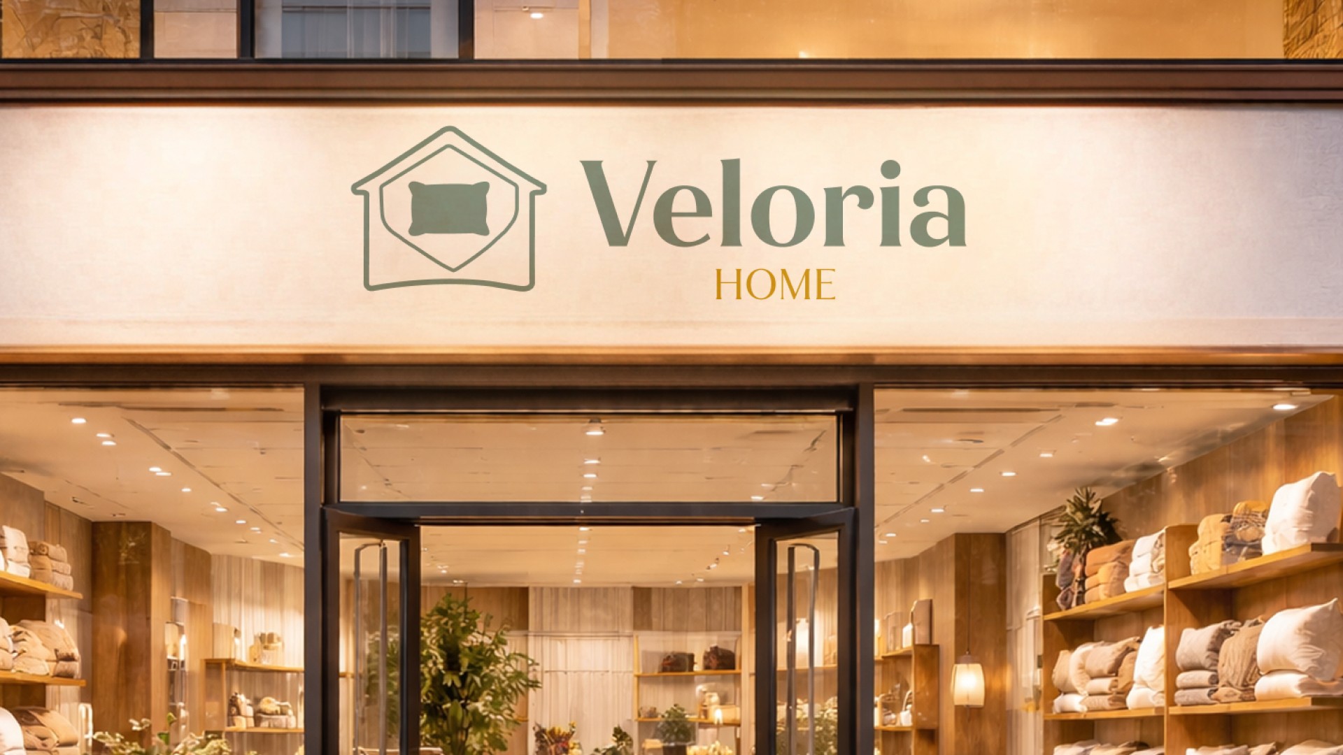
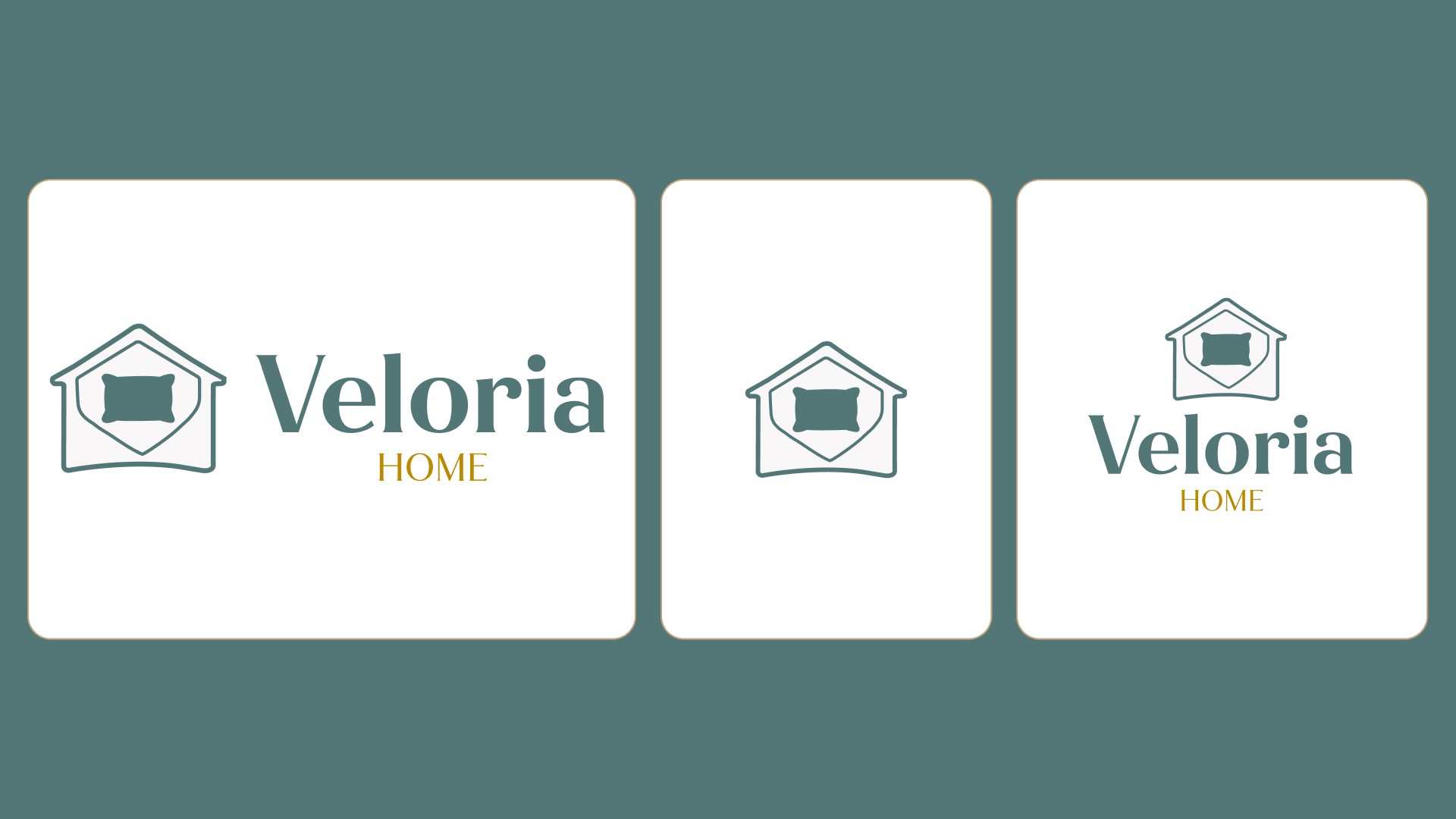
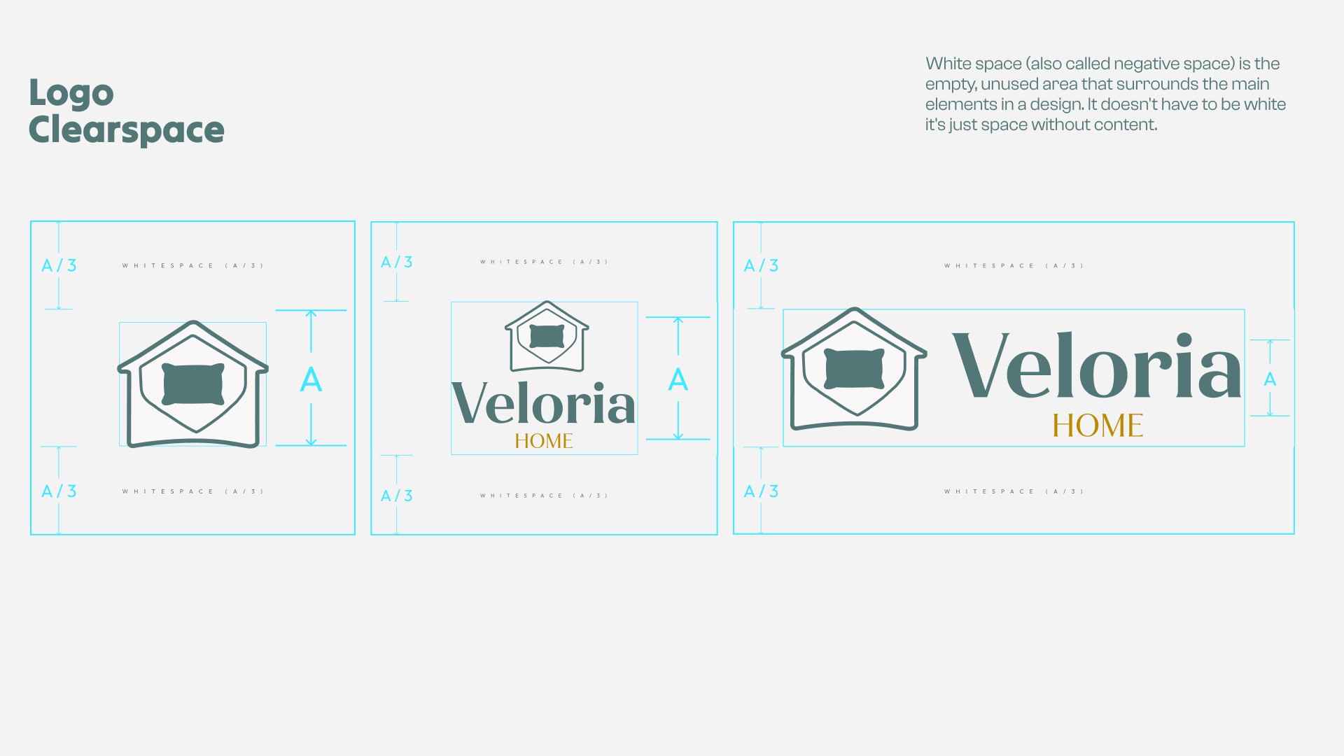
We designed a logo that reflects both the brand name and what Veloria Home does. A simplified home outline frames the mark, with a subtle “V” cut into a rounded triangle. At the centre, a pillow icon doubles as a top-down bed, highlighting the main product categories.
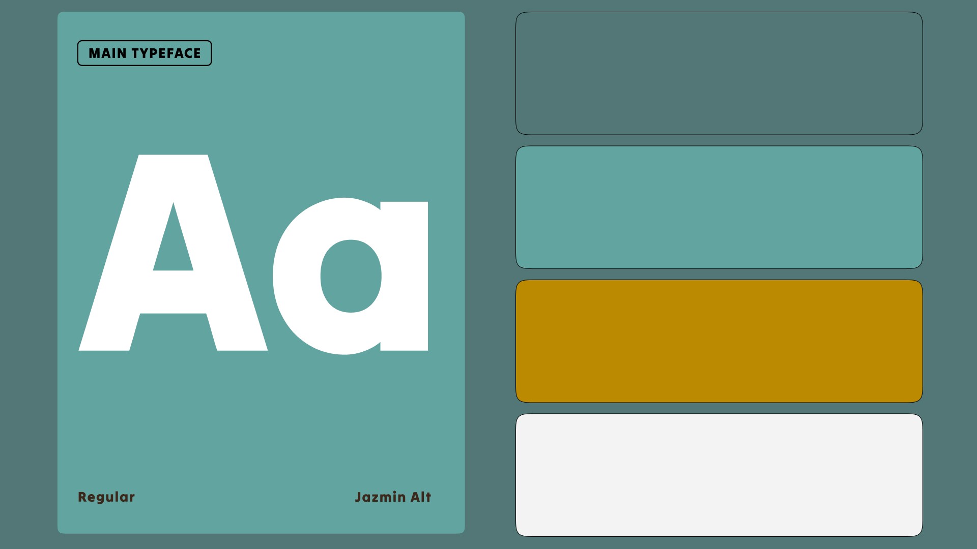
Typography blends approachability with clarity:
Jazmin Alt Semi Bold for “Veloria” – friendly, trustworthy, and slightly bold.
Tilt Neon Regular for body text and “Home” – modern, smooth, and complementary.
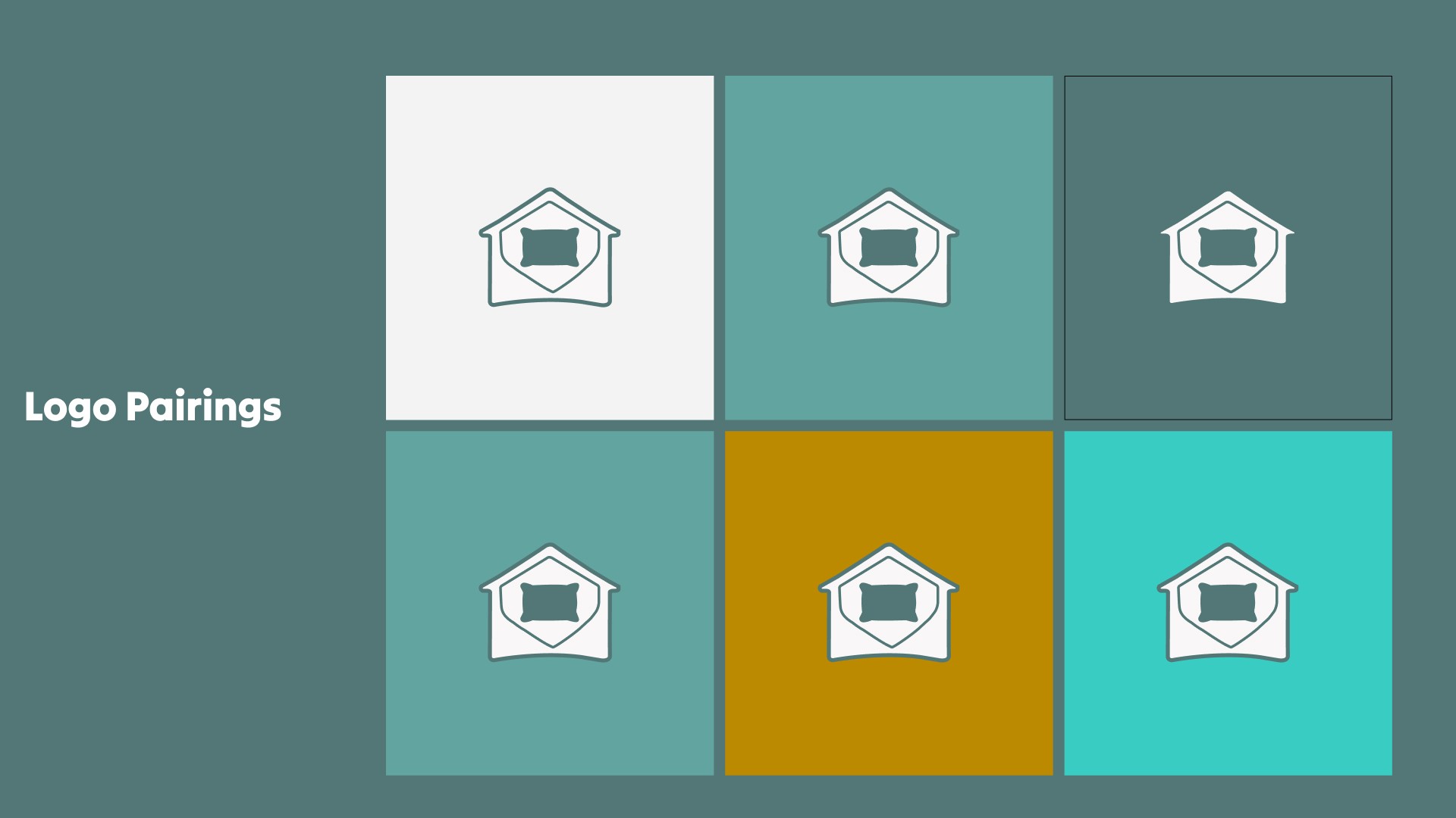
The stacked logo, wordmark, and colour palette tie everything together:
Gold: warmth and premium accents
Pine Green & Sage: calm, balanced, natural tones
Off-White: clean, soft base
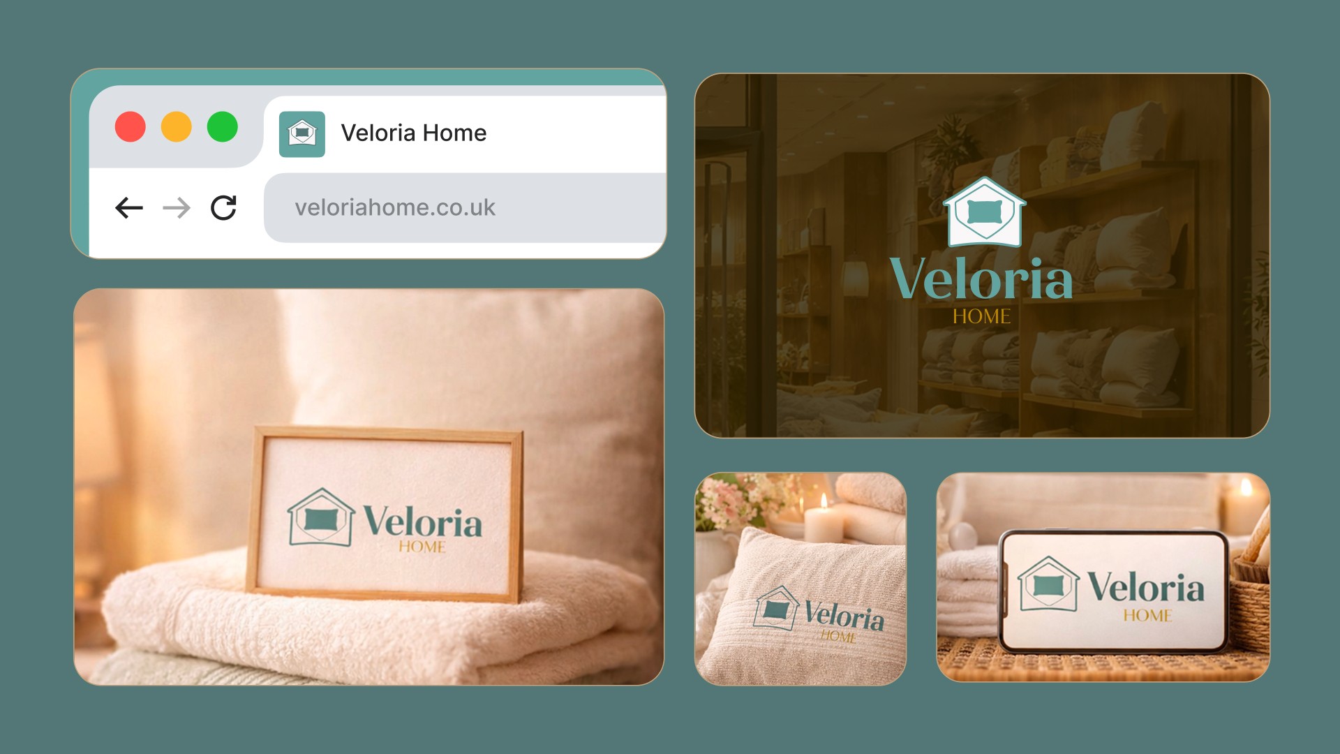
Every choice supports the brand’s warmth, clarity, and inviting personality, creating a cohesive identity for digital and future physical spaces.
Results / Impact
Veloria Home’s brand transformed from lifeless to engaging. The house-shaped logo positions them clearly within home retail, the pillow and “V” reinforce comfort and identity, and the palette and typography create warmth, trust, and balance.
Tone of voice mirrors the visuals: warm, clear, and confident. Messaging guides customers simply and practically, making home styling stress-free and approachable. Now, Veloria Home feels like a real, grounded brand, inviting customers to feel at home while shopping boosting trust, engagement, and recognition.
Takeaways / Learnings
Strategy is everything brand sessions define the outcome.
Align visuals with the customer experience to make the brand feel authentic.
Subtle symbols can communicate values without clutter.
Colour, typography, and tone work together to create warmth, trust, and clarity.
Back to all work