Harlin & Co.: Brand identity case study
Brand identity - 2026, Interior tech. Client: Harlin & Co..
Harlin & Co. designs £10–20m homes with advanced technology. It needed an identity that matched its values.
Clarity Call
DecoHatch had outgrown its name and its look. The studio designs complete living experiences in £10–20m homes using advanced technology, but its identity read like a conventional interior designer.
The brief: an identity as advanced and considered as the homes it creates.
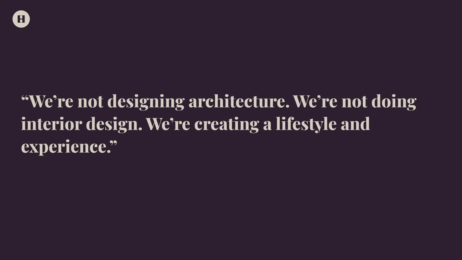
Logic
Strategy set four values: trust, taste, confidence and craftsmanship. The voice became quiet prestige, measured and warm, never flashy.
Marble, gold and furniture icons were ruled out. Authority had to come from restraint.
Execution
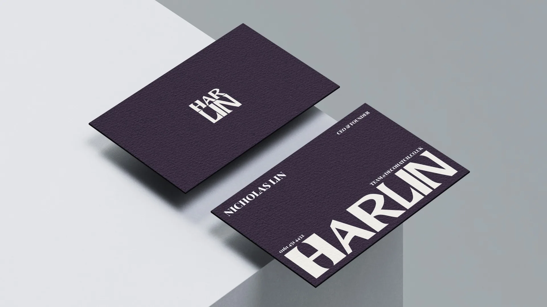
A custom stacked mark sits above the wordmark like a heritage crest, with an H iconmark for small spaces.
Damson is the signature, Bone the quiet ground. Playfair Display is the only typeface, used at every level.
Asset Creation
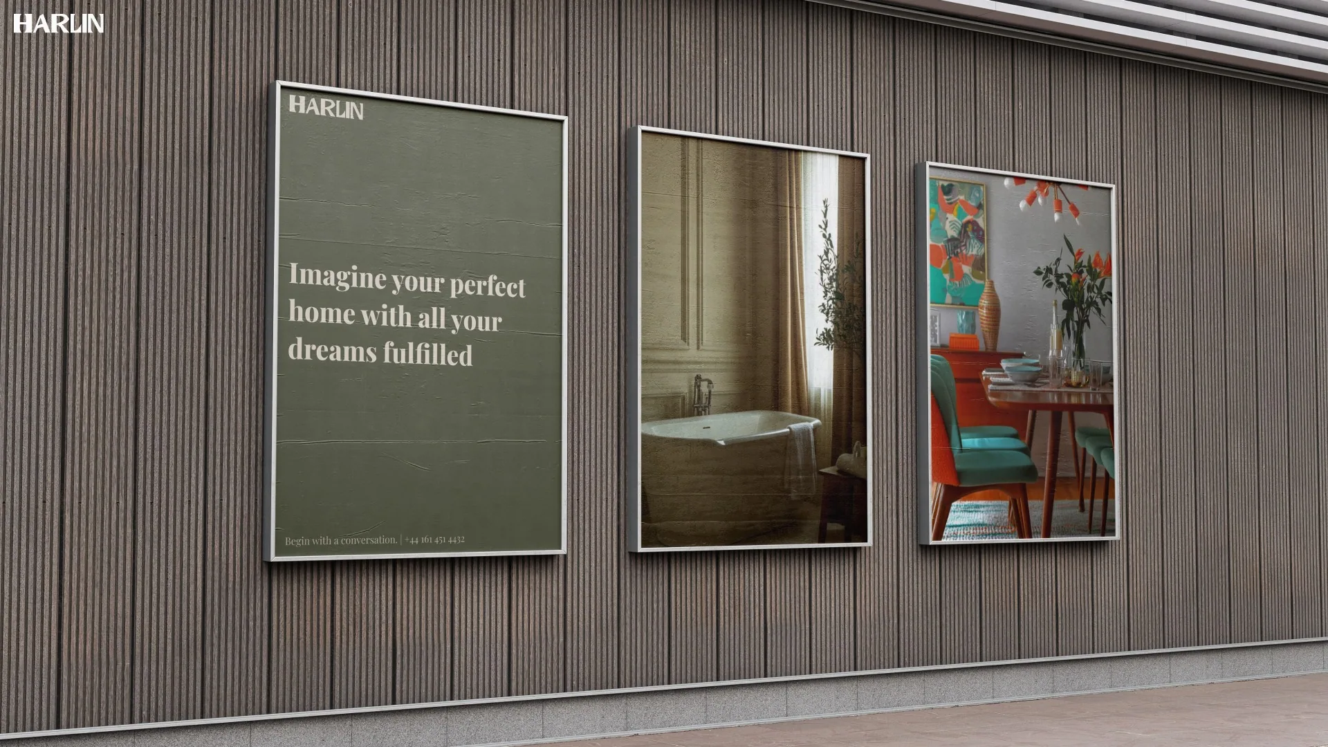
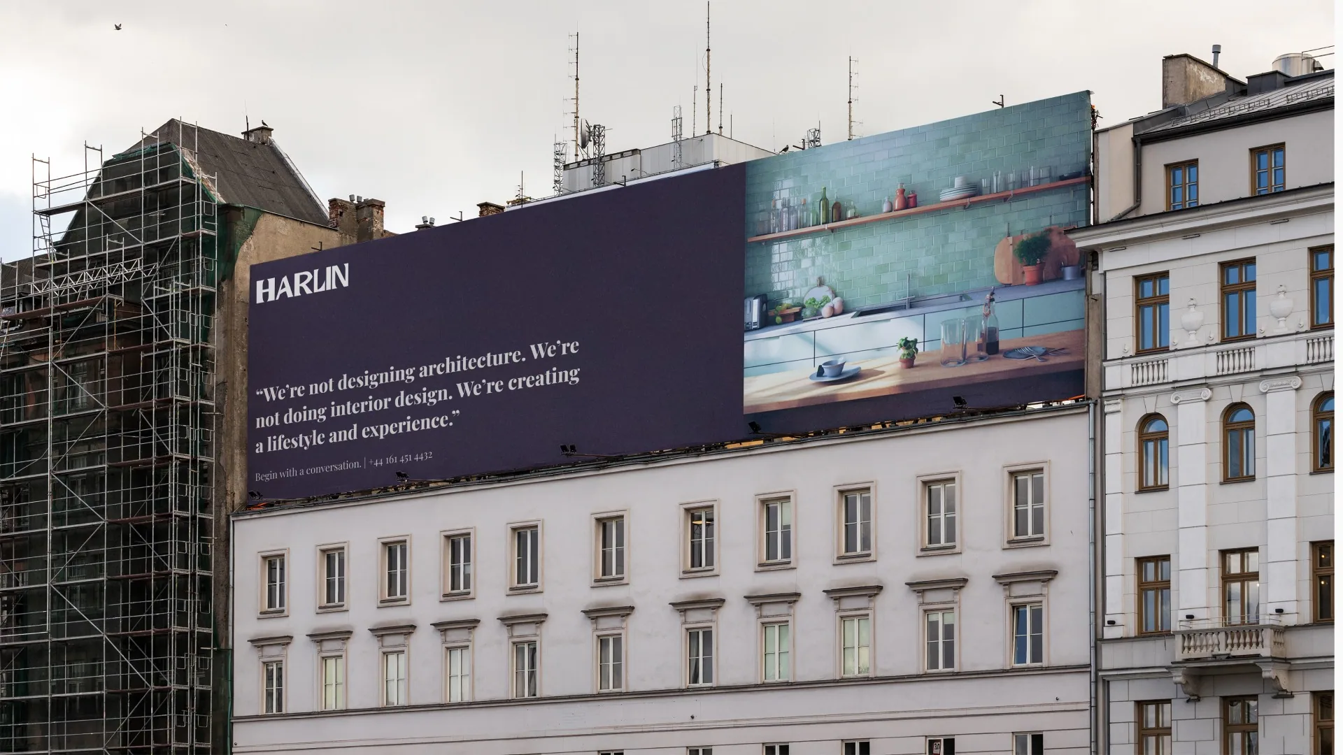
Logomark, wordmark and iconmark in three colourways, a seven-colour palette and the type system, applied to business cards, posters and outdoor.
Everything lives in a brand guidelines website, with a tone-of-voice generator the team uses to write on-brand lines.
Results
Harlin & Co. now looks like the studio it is, and the team works from one clear system.
In Nicholas's words: “From the initial concepts through to the final brand system, everything felt considered and high-end.”