Mevo Banking: Brand identity case study
Brand identity - 2025, Fintech. Client: Mevo Banking Group.
Mevo makes banking simple and reliable. They needed a brand that showed speed, trust, and forward momentum.
Clarity Call
Mevo's fintech product was fast and reliable, but its branding didn't say so. Early ideas blended into competitors like Monzo, Revolut, and Starling, and nothing felt original.
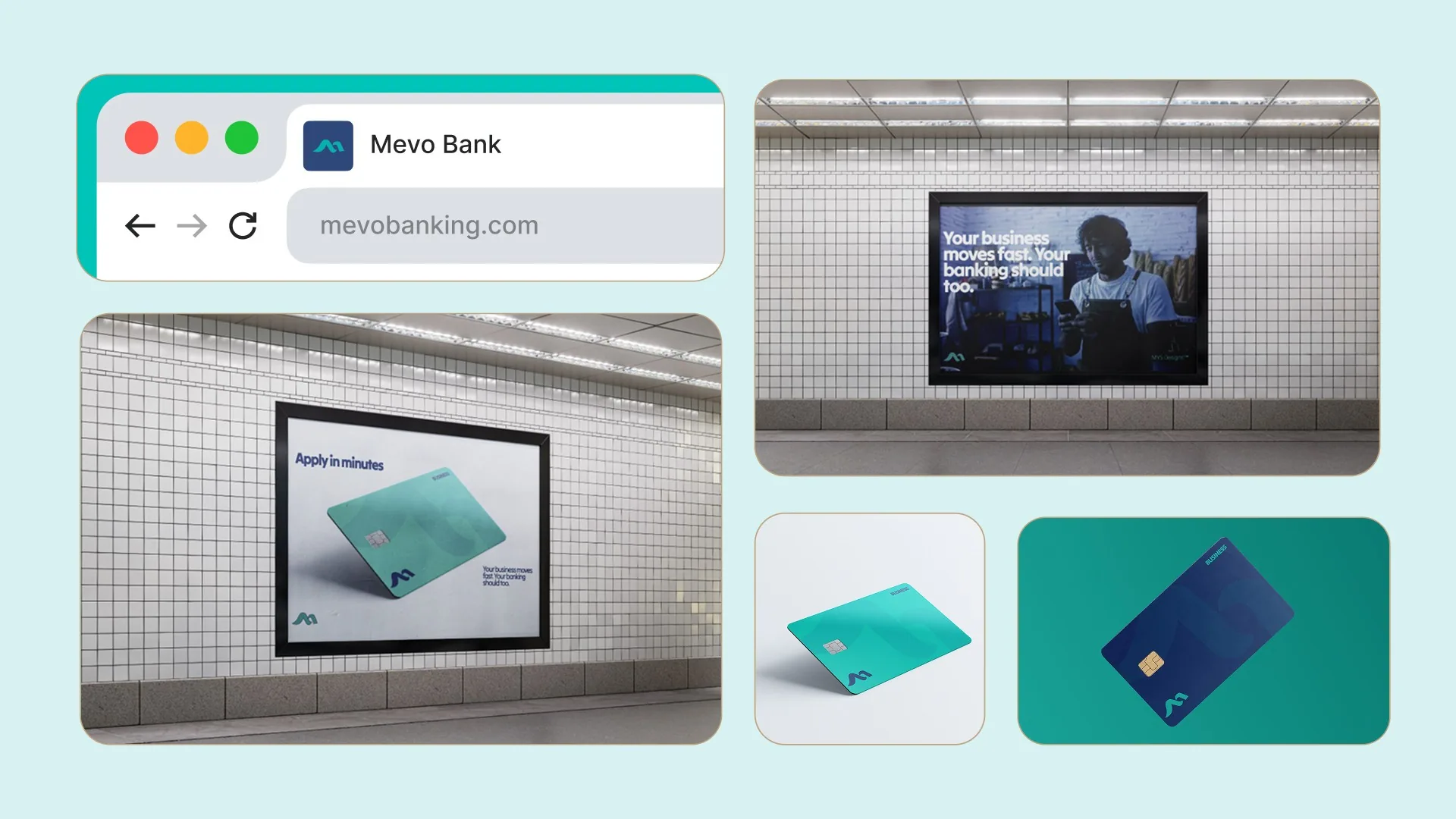
Logic
Strategy sessions uncovered four values: simplicity, reliability, progress, and connection. The audience was risk-takers, doers, and small business owners.

Execution
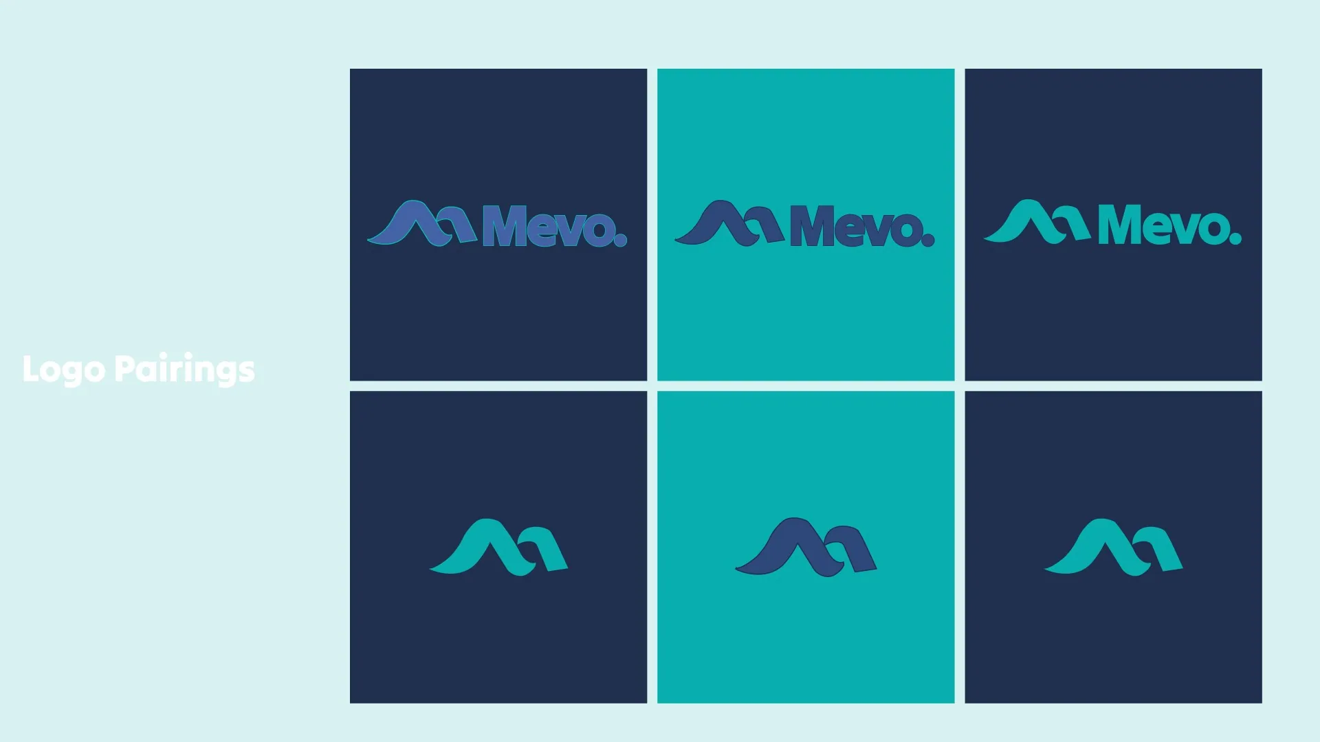
The breakthrough came from movement: money moves, people move, waves move. Two waves form an M, paired with fluid forms, structured layouts, and deep blues for stability.
Asset Creation
The M logo, a visual identity of fluid forms and structured layouts, and a tone that is calm yet confident.

Results
The brand reflects who Mevo really is. It resonates with its audience and sets Mevo apart in a crowded fintech market.