PinkLime: Brand identity case study
Brand identity - 2025, Web design. Client: Mona, Co-founder.
A complete brand redesign for a Manchester women-led web design agency, keeping its signature pink and modernising the logo and visuals.
Clarity Call
Despite strong client work, the logo had been tweaked into an outdated state, and the website and visuals didn't show the agency's professionalism or personality.
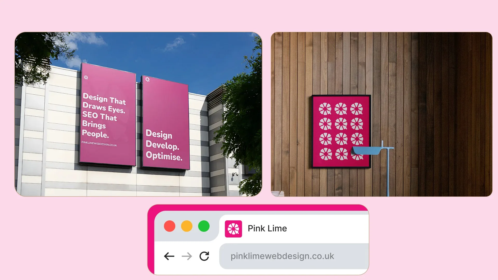
Logic
Keep the signature pink, show personality, signal credibility, and stay serious without being corporate: human, but not soft.
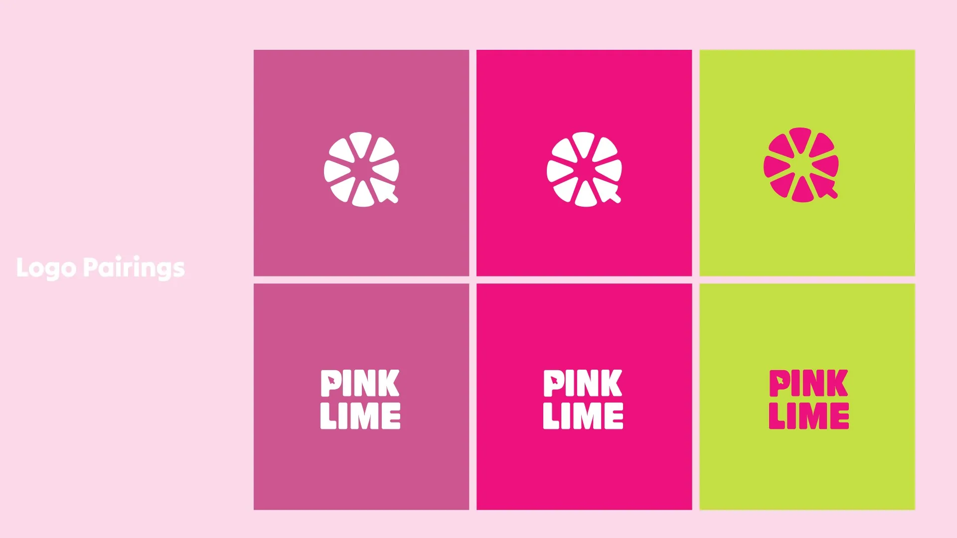
Execution
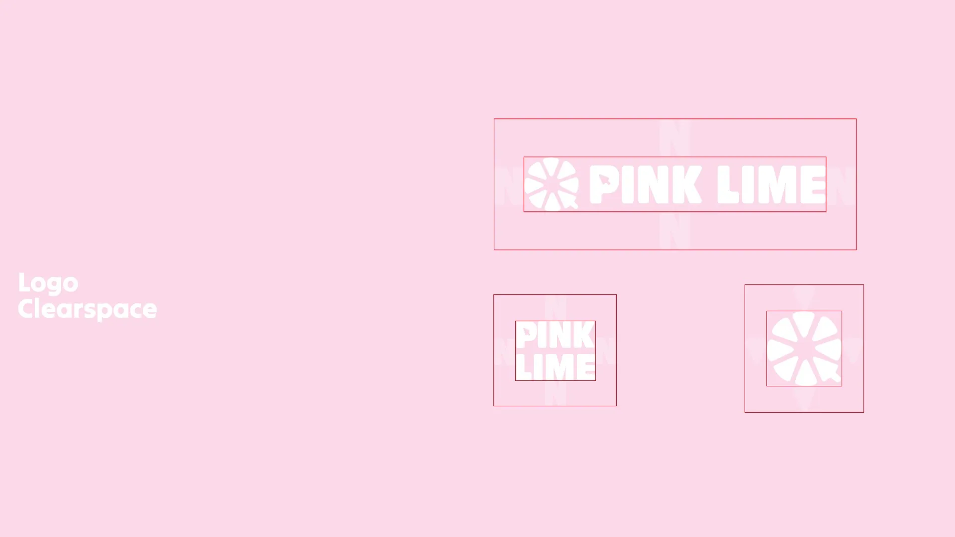
A lime with a slice replaced by a cursor. Rounded, calm, modern, and playful.
Asset Creation
Updated colours, typography, and graphics aligned with a playful, professional personality.
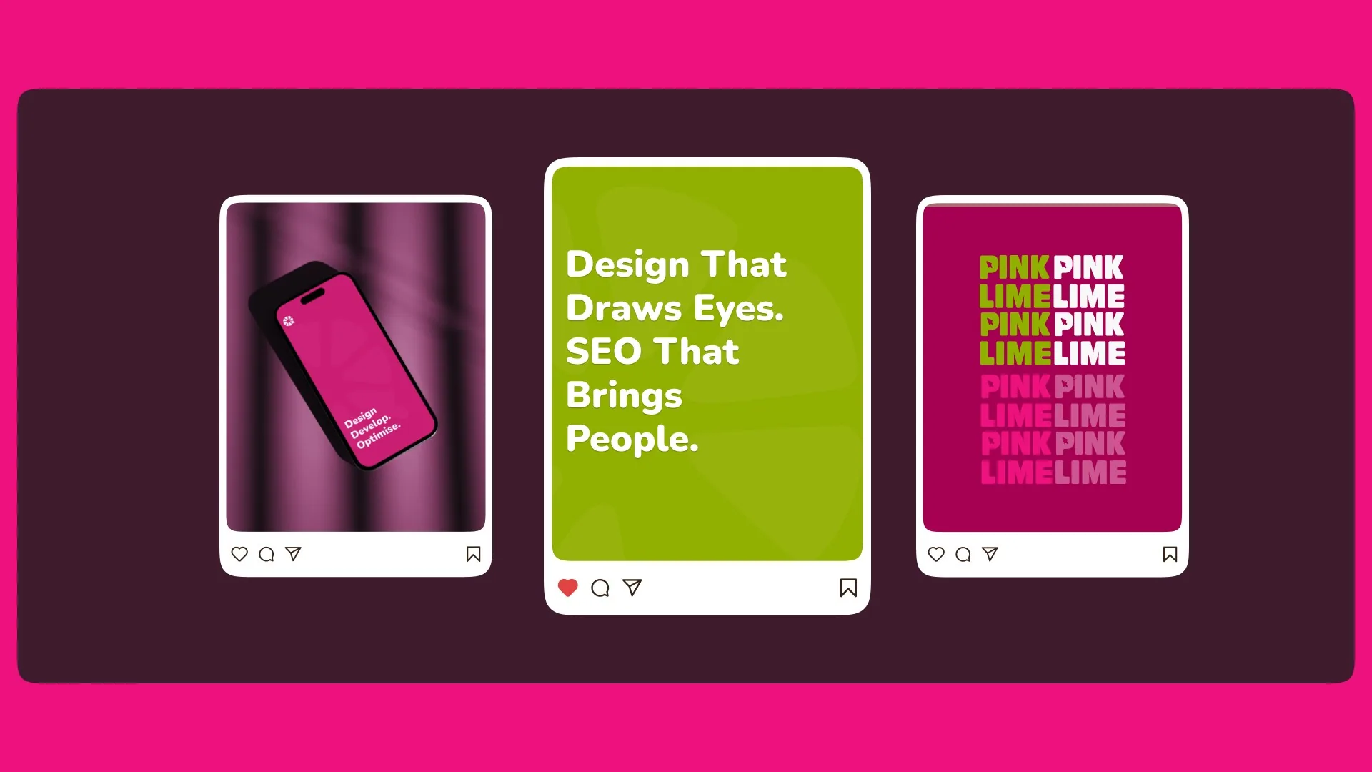
Results
Clients now see a professional, playful, and human agency. The brand speaks their value before the first conversation.