SS Security Co: Logo design case study
Logo design - 2026, Security. Client: SS Security Co.
SS Security Co avoided the padlock cliché for a mark built on strength, warmth, and recognition.
Clarity Call
A Manchester security startup with nationwide corporate and residential clients and no branding yet. In an industry full of padlocks and shields, the mark had to carry the same authority as the service.
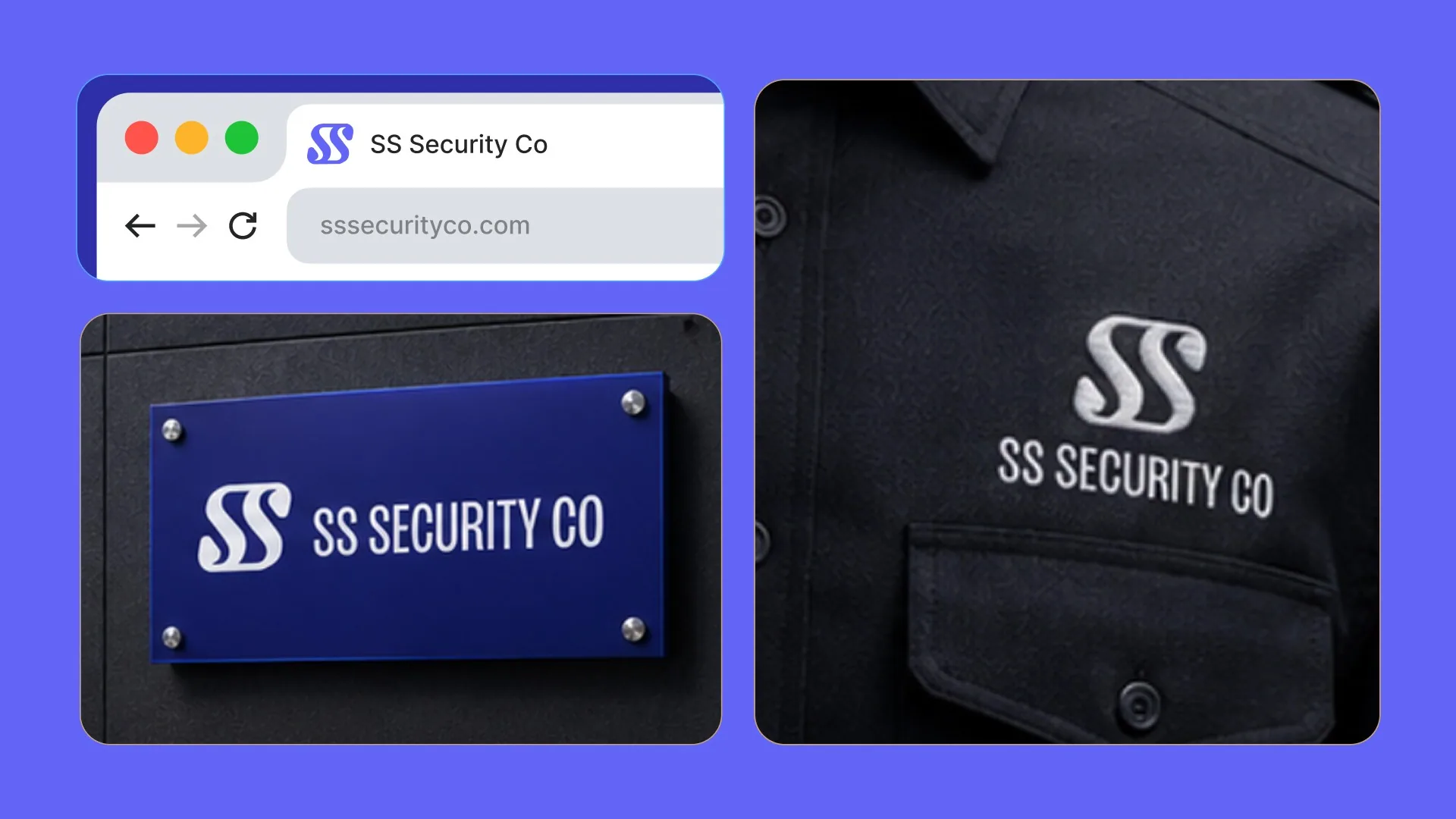
Logic
The identity was built on six principles: strength, approachability, simplicity, legibility, professionalism, and national reach. A first concept, two clashing S's, read as busy, so the approved direction became a doubled SS where straight lines and curves work together.
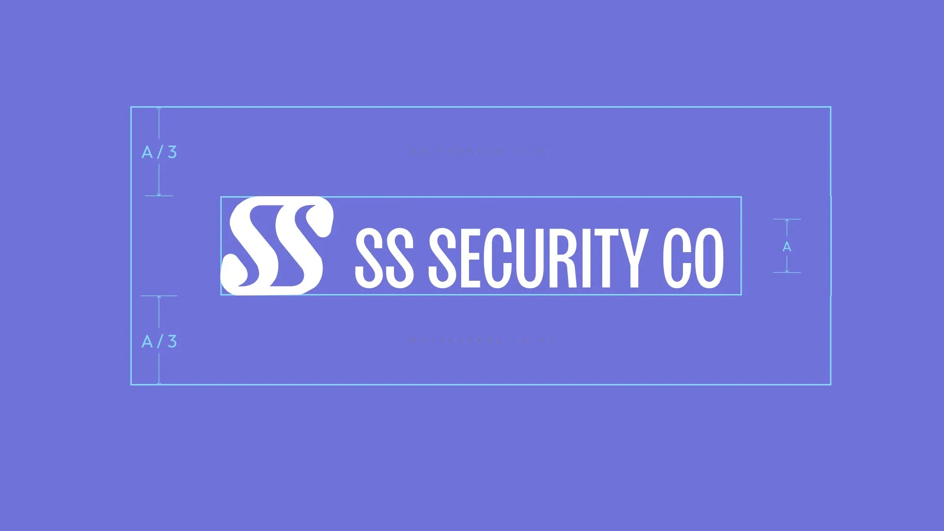
Execution
Straight lines communicate strength and curves communicate approachability. Repeating the letterform keeps the mark legible whether it sits small on a laptop or large on a jacket. The palette is a deep blue pulled toward purple for trust.
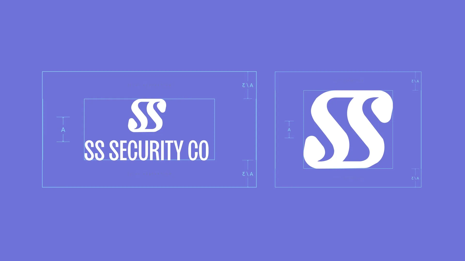
Asset Creation
Logo construction and clear-space guidelines, applied across business cards, laptop decals, and uniform embroidery.
Results
The branding and the expertise now work together. The identity carries the same authority the company already had in the industry.